To mix and match prints and hues in your boho wardrobe, start with a versatile color palette of earthy tones, neutrals, and vibrant accents. Ground bold patterns with solid neutrals, and keep colors harmonious by sticking to similar tones or using complementary shades. Layer different textures and use neutrals to balance busy prints, creating cohesive, eye-catching outfits. Keep experimenting with these principles, and you’ll craft effortlessly stylish boho looks full of personality.
Key Takeaways
- Use a cohesive boho color palette of earthy tones and neutrals to create harmony when mixing prints and hues.
- Balance bold patterns with solid neutral pieces to maintain visual stability and highlight statement prints.
- Match prints with similar color schemes or complementary hues for seamless, harmonious mixing.
- Layer warm earth tones with vibrant hues, balancing energy and stability for dynamic outfits.
- Incorporate textured fabrics and strategic layering to enhance visual interest and grounding in your boho wardrobe.
Understanding the Foundations of a Boho Color Palette
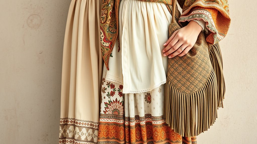
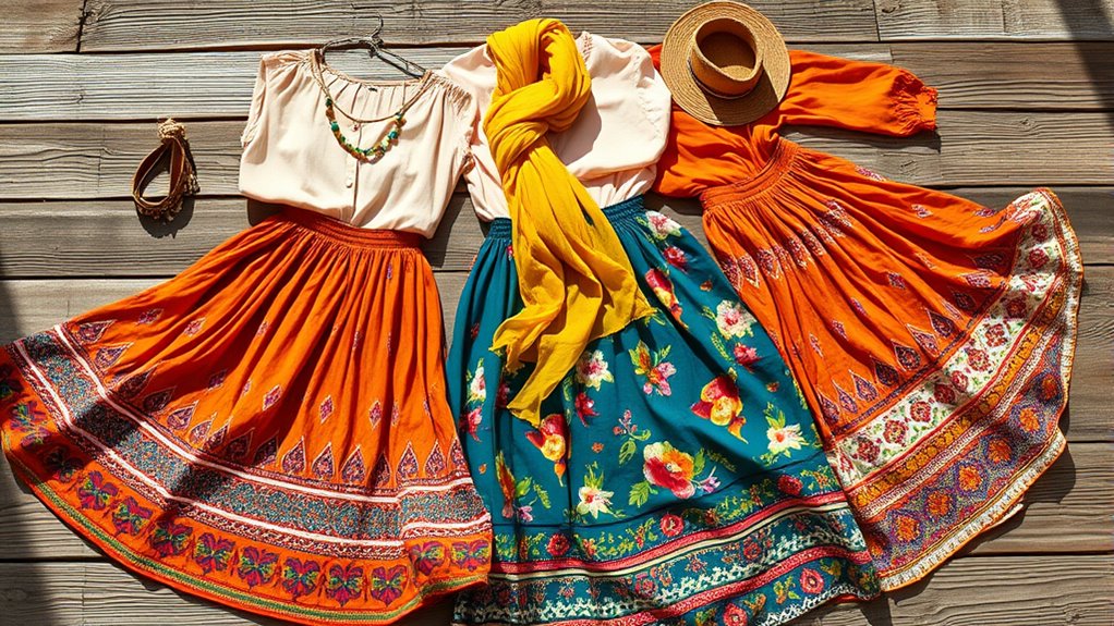
To create an authentic boho look, understanding the foundations of a boho color palette is essential. You’ll want to focus on earthy tones like terracotta, ochre, and olive, paired with neutral colors such as beige, cream, and brown. These create a neutral palette that serves as a versatile base for mixing prints and textures effortlessly. A cohesive palette of 6 to 12 shades ensures color harmony, making pattern pairing easier without overwhelming your look. Balancing warm and cool hues adds seasonal versatility, allowing your outfits to work year-round. This thoughtful approach to color helps maintain the boho aesthetic, encouraging texture balance and effortless style. Mastering these fundamentals empowers you to craft versatile, harmonious outfits that reflect the relaxed, eclectic spirit of boho fashion. Incorporating color harmony principles can further enhance your ability to mix and match prints seamlessly.
Incorporating Warm Earth Tones and Vibrant Hues

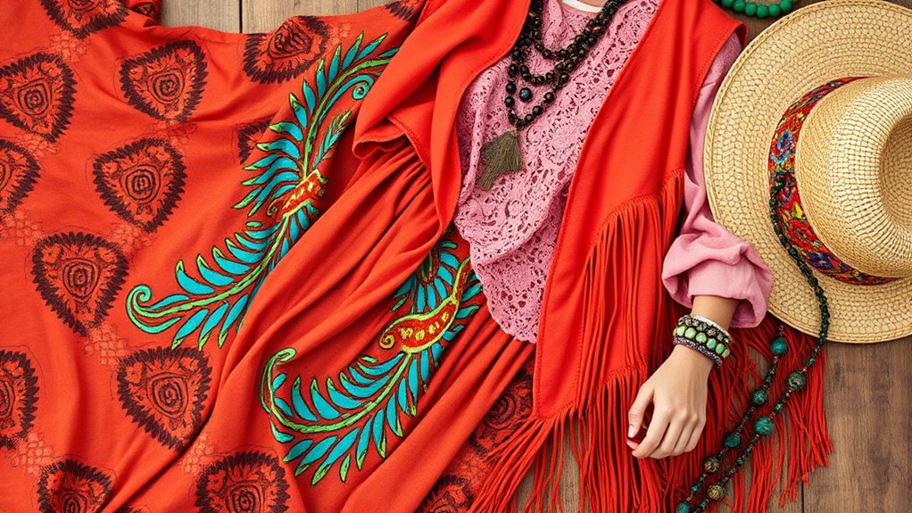
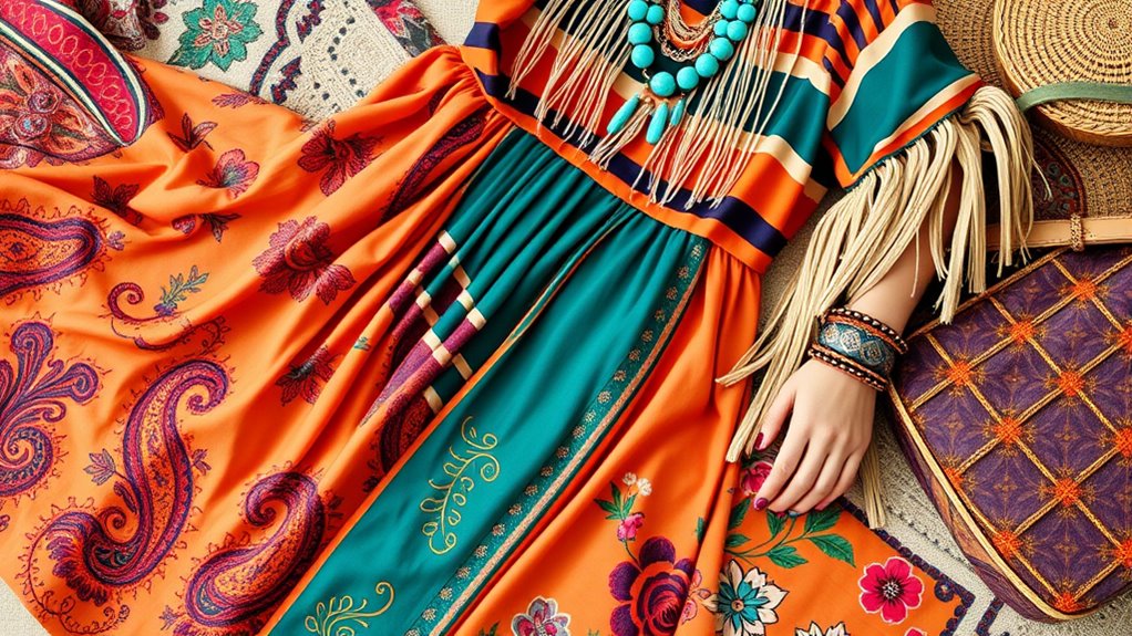
In boho fashion, incorporating warm earth tones like terracotta, ochre, and deep browns provides a grounding foundation that naturally complements vibrant hues. These natural shades form the core of your color palette, allowing you to mix colors effortlessly for layered outfits. Using rich reds, mustard yellows, and burnt oranges introduces energetic pops that energize your look while maintaining cohesion. Color theory suggests that blending warm tones with vibrant hues evokes warmth, creativity, and free-spirited energy—key traits of boho style. By balancing these shades, you create versatile outfits that blend muted earth shades with bold accents, making your styling more dynamic. Embracing color harmony principles helps you achieve a cohesive aesthetic while embracing the lively, eclectic spirit of boho fashion.
Balancing Prints and Patterns for Visual Harmony
To create a balanced boho look, start by mixing prints with similar color schemes, like florals and stripes in blues and yellows. Incorporate solid-colored pieces to anchor bold patterns and guarantee visual clutter. Keeping a consistent color palette across your prints assures your outfit feels cohesive and stylish. Additionally, selecting appropriate outdoor gear can inspire creative combinations and enhance your overall fashion statement.
Mix Similar Colors
Ever wonder how to create a cohesive boho look when mixing patterns? The key is to focus on similar colors within your color palette. Using matching hues or tonal harmony helps establish visual unity and guarantees a harmonious outfit. To achieve this, consider these tips:
- Select patterns sharing a common hue, like navy and mustard, for a cohesive look.
- Incorporate pastel pink florals with stripes to enhance color coordination.
- Use analogous colors—orange, coral, rust—for smooth progressions between prints.
- Balance bold prints with solid pieces in matching or complementing shades to reinforce harmony.
- Practicing self-awareness can help you better understand your personal style preferences, making it easier to select harmonious prints and hues.
- Exploring the sound healing science behind certain color choices or patterns can inspire more intentional and harmonious wardrobe selections.
- Understanding color psychology can deepen your appreciation of how specific hues influence mood and style choices. Additionally, paying attention to color matching techniques can further refine your ability to blend prints seamlessly. Incorporating a foundational knowledge of relationships can also enhance your overall style confidence by aligning your personal expression with your inner harmony.
Use Solid Anchors
Matching bold prints with solid pieces creates a balanced and polished boho look. Solid-colored pieces serve as anchors, allowing your patterns to shine without overwhelming. Incorporating neutral tones or muted solids helps maintain visual balance when mixing patterns and textures. These solid anchors boost wardrobe versatility, making layering options and pattern pairing easier while ensuring cohesive outfits. Strategically placing solid hues near patterned items guides the eye and sustains visual harmony, resulting in a polished appearance. Color theory can further inform your choices, helping you select hues that enhance the overall aesthetic and mood of your outfits. Understanding how visual balance is achieved can help you craft more harmonious outfit combinations. Additionally, paying attention to proportion and scale ensures that patterns and solids complement each other effectively. Use the table below to explore how different solid pieces can enhance your boho ensemble:
| Solid Piece | Pattern Pairing | Style Tip |
|---|---|---|
| Neutral tank top | Floral maxi dress | Layer for depth |
| Earth-toned blazer | Paisley skirt | Add contrast for balance |
| Muted cardigan | Geometric print | Tie outfit together |
Layering Hues and Textures to Create Depth

Layering hues and textures is key to achieving depth in boho outfits. By mixing different shades—like warm terracotta with cool teal—you create visual interest and a sense of dimension. Incorporate contrasting textures such as linen, crochet, and suede to enhance the tactile dimension of layered looks. Use semi-transparent fabrics over solid bases to add subtle depth, letting colors and textures peek through. Consider these techniques:
- Combine warm and cool hues for vibrant contrast.
- Mix textures like soft cotton against rugged denim.
- Layer semi-transparent fabrics over solid colors.
- Use shades within the same color family for cohesion and complexity.
- Paying attention to fabric care ensures your layered textures stay vibrant and undamaged over time. Additionally, selecting sustainable materials can promote eco-friendly fashion choices and enhance the longevity of your garments. Incorporating water-resistant fabrics can also help your layers remain protected from weather elements, especially when layering for outdoor boho looks. Being mindful of clothing maintenance helps preserve the vibrancy and integrity of layered textures, ensuring your outfits stay fresh and stylish longer.
These methods make your boho fashion more dynamic, ensuring each outfit has a rich, multidimensional quality that draws the eye.
Using Neutrals to Ground and Enhance Your Looks
Using neutrals as a base helps you create a balanced and cohesive boho look. They serve as a calming backdrop that makes bold patterns and vibrant colors pop without overwhelming. When you incorporate natural textures and earthy tones, your ensemble feels more grounded and effortlessly stylish. Incorporating color theory principles can further enhance how different hues and prints work together harmoniously. Additionally, understanding how AI-generated insights can inform fashion trends emphasizes the importance of AI in trend forecasting for a modern wardrobe. Engaging with creative practice can also inspire unique styling combinations and innovative accessories, elevating your overall aesthetic.
Neutral as a Base
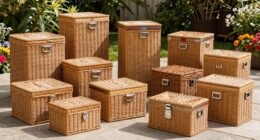
A neutral color palette creates a versatile foundation that makes your boho outfits both cohesive and striking. Neutral tones like white, beige, brown, and black serve as a wardrobe foundation, allowing vibrant hues and bold prints to shine. To build a versatile palette, consider:
- Incorporating neutral shades as layering basics for effortless styling.
- Using natural materials—wood, linen, woven straw—to add subtle depth and enhance the boho aesthetic.
- Balancing busy patterns and textures with neutral shades for a cohesive look.
- Creating outfit harmony by starting with neutral tones, then adding statement pieces or accessories.
- Understanding how best heat pump features can improve energy efficiency and comfort, ensuring your wardrobe choices are as functional as they are stylish. Additionally, incorporating versatile vacuum models can help maintain your wardrobe and living space with ease, keeping your environment as relaxed and inviting as your clothing choices.
This approach simplifies styling, guarantees outfit cohesion, and lets you mix prints confidently while maintaining a relaxed, natural vibe.
Balancing Bold Patterns
When incorporating bold patterns into your boho outfits, neutrals serve as essential anchors that prevent the look from becoming overwhelming. Neutral tones like white, beige, and taupe provide a versatile backdrop that creates visual balance and allows statement prints to shine. Layering with neutral pieces enhances contrast, making bold patterns stand out without clashing. Using neutrals as a foundation gives you a cohesive look, especially when mixing multiple prints—these tones act as visual rest, helping your eye appreciate textures and details. This balanced mixing results in a harmonious outfit where vibrant patterns are highlighted without overpowering. Ultimately, neutrals ground your ensemble, ensuring your bold patterns contribute to a stylish, well-balanced boho aesthetic. Incorporating color coordination techniques can also inspire a sophisticated and polished touch to your overall style, complementing your curated wardrobe.
Tips for Mixing and Matching Colors and Prints Seamlessly
To create a cohesive boho look, you should focus on choosing prints and colors that naturally complement each other. Achieve color harmony by selecting prints with shared palettes or complementary hues, guaranteeing seamless print mixing. Use neutral pieces as visual buffers to break up bold prints and create contrast pairing, preventing visual overload. Balance large, busy patterns with subtler textures or smaller prints to maintain texture balance and avoid overwhelming the eye. Consider seasonal transition by mixing warm and cool tones thoughtfully, pairing warm-colored prints with cool-toned accessories. Additionally, apply color theory principles, like matching analogous or complementary colors, to enhance pattern scale and ensure a harmonious blend of hues for a stylish, effortless boho look. Understanding trailer music composition techniques can inspire innovative approaches in creating your own unique style.
Frequently Asked Questions
How Can I Incorporate Metallic Accents Into My Boho Palette?
To incorporate metallic accents into your boho palette, start with subtle touches like gold or silver jewelry that complement your prints and hues. You can also add metallic accessories such as belts, bags, or shoes to create a chic contrast. Mixing metallics with earthy tones enhances your look effortlessly. Keep the metallics understated for a balanced, boho vibe that feels both relaxed and stylish.
What Are Some Beginner-Friendly Print Mixing Techniques?
So, you wanna master print mixing without turning your closet into a circus? Start simple: pair a floral top with striped pants, keeping colors within a similar palette. Stick to two prints max, and let one be bold while the other’s subtle. Play with scale—big prints with tiny ones—and always balance busy patterns with solid colors. Soon, you’ll look effortlessly stylish, not like you lost a fabric fight.
How Do I Choose Accessories to Complement My Boho Outfits?
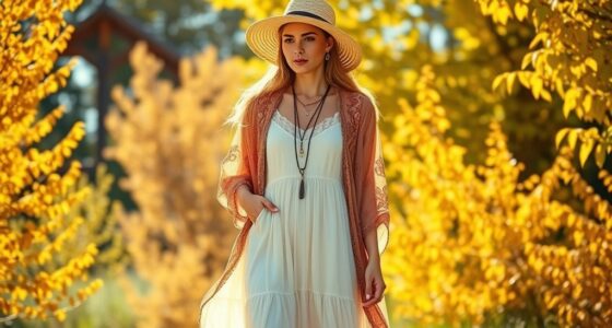
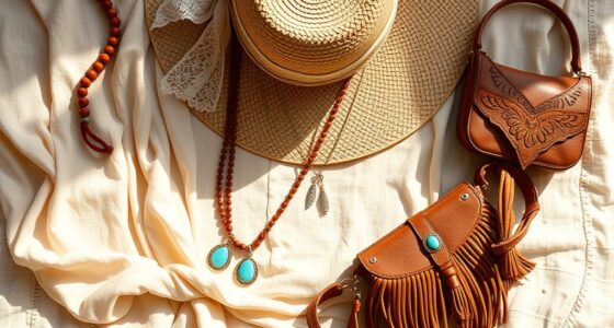
When choosing accessories for your boho outfits, focus on embracing natural materials and earthy tones that enhance your look. You can layer necklaces, stack bracelets, or add a wide-brim hat for a relaxed vibe. Mix textures like leather, beads, and feathers for visual interest. Keep your accessories slightly eclectic but balanced, so they complement your overall style without overwhelming it. Trust your instincts and have fun experimenting!
Can I Mix Vintage and Modern Prints Without Clashing?
Think of your wardrobe as a garden where vintage and modern prints bloom together. You can mix these styles by balancing bold patterns with more subtle ones, much like a painter blending colors. Keep a common hue or neutral tone to unify the look, so nothing clashes. Trust your instincts, and don’t be afraid to experiment—your unique style will emerge beautifully, just like a well-curated masterpiece.
What Are the Best Fabrics for Enhancing Boho Color Combinations?
You should choose fabrics like lightweight cotton, flowing linen, and airy chiffon to enhance boho color combinations. These materials allow colors to appear vibrant and blend effortlessly, creating a relaxed, earthy vibe. Natural fibers help your outfits breathe and move beautifully, amplifying the boho aesthetic. By selecting textured fabrics with subtle sheen or matte finishes, you add depth and richness to your mix of prints and hues, making your style truly stand out.
Conclusion
Embracing a boho color palette isn’t just about random mixing—it’s rooted in the idea that nature’s harmony inspires stylish expressions. Studies suggest that mixing warm earth tones with vibrant hues can boost your mood and confidence. So, trust your instincts, experiment with patterns and textures, and let your wardrobe reflect your free-spirited vibe. Ultimately, the right combination creates a unique, balanced look that feels as effortless as a walk in the woods.