
Discover how combining terracotta, sage, and jewel tones can create a stunning, nature-inspired palette. Terracotta evokes warmth and comfort, while sage green offers calm and renewal. Jewel tones add richness and vibrancy, creating striking contrasts with earthy neutrals. Together, these colors balance organic authenticity with luxury, perfect for designing spaces that feel both vibrant and calming. Keep exploring to see how you can harmonize these hues to craft the perfect natural-inspired environment.
Key Takeaways
- Combine terracotta, sage green, and jewel tones for a vibrant, organic palette inspired by natural elements.
- Use earthy neutrals as a grounding base to enhance the warmth of terracotta and richness of jewel tones.
- Incorporate botanical accents like eucalyptus or ferns to complement sage and add freshness to the palette.
- Balance the warmth of terracotta with cool jewel tones for contrast and visual interest.
- Apply these colors across interiors, textiles, or designs to evoke a natural, luxurious, and authentic aesthetic.

Nature-inspired color palettes draw from the vibrant and subtle hues found in the natural world, offering a rich source of inspiration for design and artistry. When you incorporate earthy neutrals into your space or project, you create a calming foundation that reflects the organic tones of soil, stone, and sand. These colors serve as a versatile backdrop, making other elements stand out while maintaining a sense of groundedness. Pairing earthy neutrals with botanical accents—like lush green leaves, delicate floral patterns, or sprigs of herbs—adds life and freshness to your design. This combination brings a soothing yet lively atmosphere, reminding you of peaceful walks through a forest or a stroll in a blooming garden.
Earthy neutrals and botanical accents create a calming, natural atmosphere reminiscent of peaceful forest walks and blooming gardens.
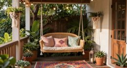
Terracotta is a warm, earthy hue that captures the essence of clay and sun-dried bricks. It’s a color that invites warmth and comfort, making it perfect for creating cozy interiors or eye-catching accents. When used alongside natural neutrals, terracotta enhances the organic feel, grounding your space with its rich, earthy depth. You can incorporate terracotta through pottery, textiles, or decorative elements, and combine it with green botanical accents to evoke a vibrant, nature-inspired aesthetic. Think of terracotta vases filled with fresh greenery or terracotta tiles paired with lush foliage for a balanced, harmonious look.
Sage, a soft, muted green, embodies tranquility and renewal. It’s a color that naturally complements earthy neutrals, creating a soothing palette that’s easy on the eyes. When you introduce sage into your design, you bring a sense of calmness and serenity, reminiscent of a gentle breeze through sagebrush or a quiet herb garden. Botanical accents like eucalyptus, ferns, or succulent arrangements work beautifully with sage, amplifying the natural vibe. You might choose sage-painted walls, upholstery, or accessories, and then accentuate them with textured botanical prints or live plants to deepen the connection to nature. Additionally, understanding color accuracy is essential for achieving true-to-life hues in your design, ensuring that the colors you see are consistent across different lighting conditions and materials.
Jewel tones—like deep sapphires, emerald greens, or amethyst purples—add richness and vibrancy to a palette rooted in nature. These colors evoke the precious stones found in mineral-rich landscapes or vibrant fruits and flowers. Incorporating jewel tones with earthy neutrals creates a striking contrast that elevates your design, making it feel luxurious yet organic. Use jewel-toned pillows, art, or decorative objects against a neutral backdrop, and incorporate botanical elements to balance opulence with the natural world. This approach ensures your space feels both sophisticated and grounded in nature’s beauty.
terracotta ceramic vases
As an affiliate, we earn on qualifying purchases.
As an affiliate, we earn on qualifying purchases.
Frequently Asked Questions
How Do These Palettes Influence Mood and Atmosphere?
These palettes markedly influence your mood and atmosphere by creating emotional impact and evoking cultural symbolism. Terracotta brings warmth and comfort, while sage offers calmness and serenity. Jewel tones add richness and luxury, boosting confidence and vibrancy. Together, they foster a balanced environment that feels both grounding and inspiring, shaping how you feel and interact within the space. You’ll notice a lively yet soothing ambiance that energizes and relaxes simultaneously.
Can These Colors Be Used Effectively in Interior Design?
You can definitely use these colors effectively in interior design. Focus on smart color pairing to balance warm and cool tones, creating harmony. Incorporate texture integration, like soft fabrics or rough wood, to add depth and interest. For example, pair terracotta with sage for a calming vibe, while jewel tones add richness. By thoughtfully combining these colors and textures, you’ll craft inviting, vibrant spaces that reflect natural beauty.
What Are the Best Complementary Color Combinations for These Tones?
Imagine a sunset blending warm terracotta with cool sage; this harmony is achieved through complementary color pairings. For your palette, use deep blues or teals and soft blushes to create striking contrasts. Applying color harmony principles, pair jewel tones like amethyst with gold accents, or balance terracotta with muted greens. These combinations will bring vibrancy and depth, making your space feel both lively and cohesive.
How Do Lighting Conditions Affect the Appearance of These Colors?
Lighting conditions markedly influence how you perceive these colors. Bright, natural light enhances their vibrancy, making terracotta warm and jewel tones rich. In dim or artificial lighting, colors may appear muted or different, altering your perception of warmth and depth. You should consider lighting effects when designing spaces, as they directly impact color perception, ensuring your chosen palette maintains its intended mood and appeal under various lighting scenarios.
Are These Palettes Suitable for Both Modern and Traditional Styles?
You’ll find these palettes offer great versatility across styles, blending modern and traditional aesthetics seamlessly. Their natural hues evoke warmth and authenticity, making them suitable for various décor themes. Plus, each color carries cultural significance—terracotta for earthiness, sage for tranquility, and jewel tones for luxury—allowing you to create spaces that feel both timeless and contemporary. These palettes adapt beautifully, enhancing your style with depth and meaning.

Sunbrella Outdoor Fabric by The Yard | Cast Sage | Official Sunbrella Seller | Indoor or Outdoor Upholstery Fabric for Chairs, Cushions, Drapery, Pillows, Furniture
OFFICIAL SUNBRELLA FABRIC STORE 48092-0000: Your source for Sunbrella Fabric by the Yard, directly from the factory. Choose…
As an affiliate, we earn on qualifying purchases.
As an affiliate, we earn on qualifying purchases.
Conclusion
Embrace these nature-inspired palettes like a breath of fresh air, letting terracotta, sage, and jewel tones paint your world with warmth and serenity. Imagine your space blossoming into a lush garden, where earthy and vibrant hues dance together in harmony. By harnessing these colors, you craft a sanctuary that feels as timeless and enduring as nature itself. So, immerse yourself and let your surroundings bloom with the beauty of the natural world.

MIULEE Velvet Throw Pillow Covers Set of 2, Soft Neutral Decorative Pillow Cases with Luxurious Textured Vintage Cushion Covers for Home Decor Couch Sofa Bed,Purple 18×18 inch
Luxurious Velvet Texture – These crushed textured pillowcases are made from high-quality non-elastic solid velvet that provides a…
As an affiliate, we earn on qualifying purchases.
As an affiliate, we earn on qualifying purchases.

WRFON Framed Botanical Canvas Wall Art Set of 3, Watercolor Floral Prints, Framed Flower Wall Decor for Bedroom Bathroom Living Room, 12×16 Inch Each
【Botanical Floral Wall Art Set】This framed wall art set includes three botanical floral canvas prints featuring soft watercolor-style…
As an affiliate, we earn on qualifying purchases.
As an affiliate, we earn on qualifying purchases.