
In boho interiors, color psychology helps you craft specific moods and personalities by choosing hues that evoke feelings of comfort, serenity, or energy. Warm earth tones like terracotta and browns create cozy, grounded spaces, while cool shades like mint green or pale blue inspire tranquility. Vibrant colors such as mustard yellow energize the environment. By balancing these hues creatively, you can express your personality and set the desired ambiance—more ideas await as you explore further.
Key Takeaways
- Use warm, earthy tones like terracotta and browns to evoke coziness and groundedness in boho spaces.
- Incorporate calming pastels such as mint green or lavender to promote relaxation and serenity.
- Apply vibrant hues like Moroccan yellow or deep blue to energize and add lively character.
- Utilize contrasting colors strategically to create visual interest and enhance spatial perception.
- Consider cultural and symbolic meanings behind colors to evoke specific emotional responses and personalize the space.
Understanding the Role of Color in Boho Interior Design
Color plays a crucial role in shaping the atmosphere of boho interiors by influencing emotions and perceptions. In boho interior design, color psychology guides your choices, blending earthy tones, vibrant hues, and neutral shades to evoke specific feelings. Earthy tones create a grounded, natural backdrop, while vibrant hues add energy and personality, reflecting your eclectic style and personal storytelling. Calming colors like blues and greens foster relaxation and balance, essential for ambiance creation. Additionally, understanding the impact of color contrast can help you enhance visual interest and depth within your space. By thoughtfully selecting these colors, you set the mood and communicate your unique taste. Whether you aim for lively, energetic spaces or serene retreats, understanding how different hues shape perception helps you craft a space that’s both expressive and harmonious. Incorporating color harmony principles ensures that your chosen palette creates a cohesive and pleasing environment, further elevating your design. Recognizing the importance of color symbolism allows you to intentionally select hues that resonate with your desired emotional response. Moreover, considering the trustworthiness of color choices can help ensure your palette aligns with the overall quality and authenticity of your boho decor. Exploring cultural associations of colors can also add depth and meaning to your interior palette, making your space more personalized and thoughtfully curated.
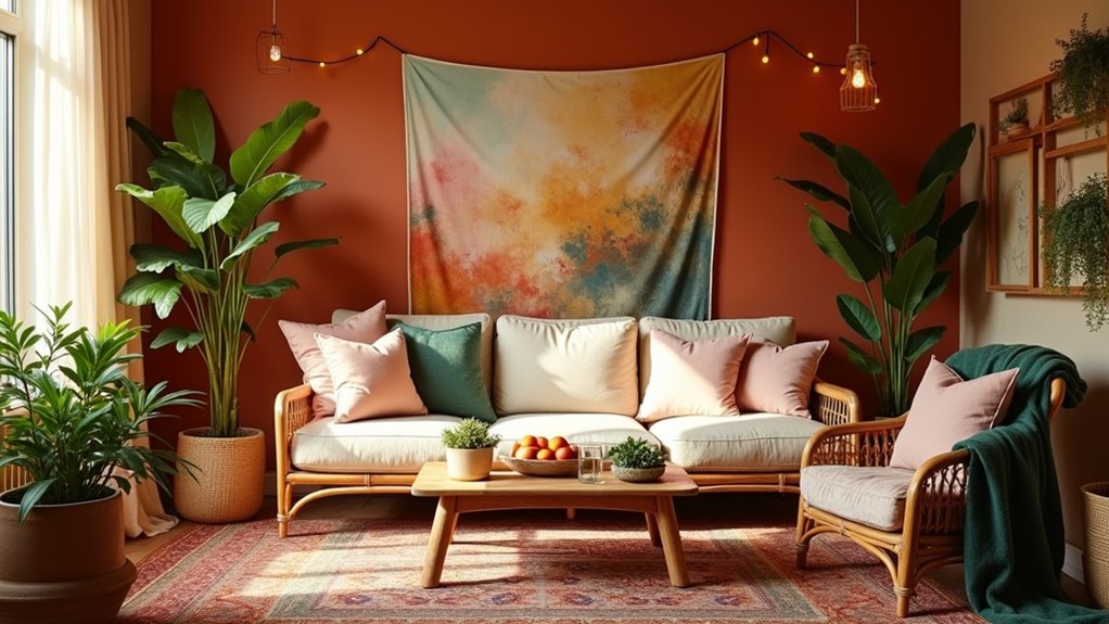
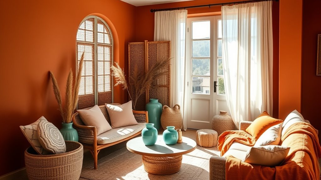
Warm Earth Tones to Evoke Comfort and Coziness
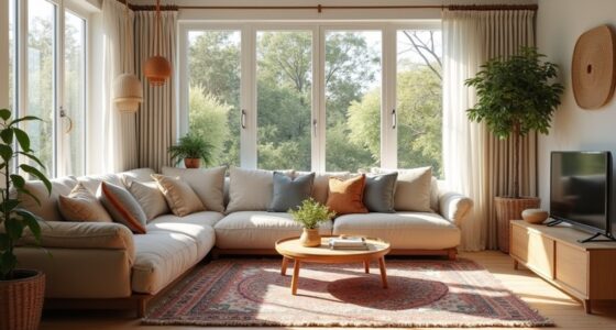
Warm earth tones like beiges, browns, and terracotta instantly create a cozy and inviting atmosphere in boho interiors. These hues promote relaxation, stability, and a strong connection to nature, making your space feel calming and grounded. Incorporating natural materials such as wood, jute, and clay with earth tones amplifies the soothing effect. They serve as a versatile neutral palette that allows vibrant textiles and accessories to stand out harmoniously. To elevate your space, consider these elements:
Warm earth tones and natural textures create a cozy, grounded boho oasis.
- Use muted colors for a serene backdrop
- Layer textures with natural materials
- Combine earthy hues with eclectic patterns
- Create a warm, inviting ambiance with balanced tones
- Incorporate vintage decor and rustic accents to enhance the cozy, organic feel creating a farmhouse bedroom ambiance. Additionally, understanding color psychology helps in selecting hues that evoke specific moods and feelings, further enriching your boho sanctuary. Incorporating natural color associations can deepen the emotional impact of your design choices. For example, the use of Vetted – Icecream Hater trends can inspire innovative ways to blend these hues and textures seamlessly. Together, these choices foster a sense of comfort, inspiration, and well-being in your boho sanctuary.
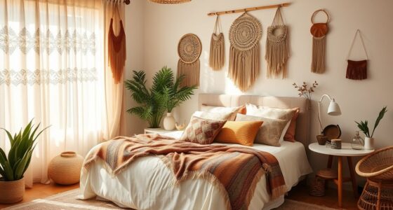
Cool Shades for Serenity and Tranquility
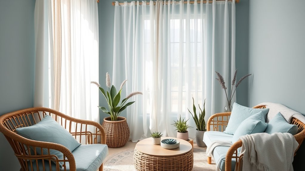
Shifting from cozy earth tones, introducing cool shades like mint green, pale blue, and lavender can transform your boho interiors into a sanctuary of calm and tranquility. These calming colors promote a relaxing atmosphere by reducing stress and lowering heart rates, making your space more inviting for rest and reflection. Light blue and green shades evoke nature-inspired colors, enhancing your connection to the outdoors and fostering a peaceful environment. Pastel hues add softness and whimsy, balancing vibrant decor with soothing tones. Incorporating cool shades as accent walls or textiles helps create a harmonious, serene space that encourages mindfulness and comfort. Additionally, understanding color psychology can help you select hues that evoke specific moods and enhance your overall well-being in your space. For example, using these hues can also support spiritual principles by cultivating an environment conducive to meditation and inner peace. Exploring color combinations can further refine your interior design, ensuring the hues work harmoniously together to promote serenity. Embracing the use of color in your decor can also influence the perception of space, making rooms appear larger and more open, which contributes to the tranquil atmosphere. Incorporating knowledge about vegetable juices and their calming effects can also inspire you to create a peaceful environment that nurtures your body and mind. By integrating these tranquil hues, you’ll craft a peaceful environment perfect for unwinding and recharging in your boho sanctuary.
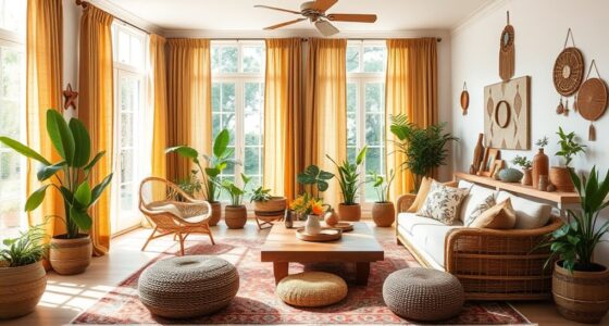
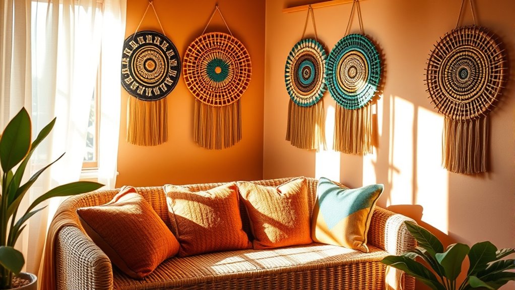
Vibrant Hues to Energize and Inspire
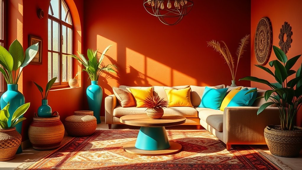
Vibrant hues like reds, oranges, and yellows instantly energize your boho space, sparking creativity and warmth. You can use bold color combinations or creative accents on walls and textiles to create focal points that inspire. Balancing these vivid shades with earthy neutrals keeps your space lively yet harmonious. Incorporating color coordination can further enhance the overall aesthetic and mood of your interior. Additionally, choosing suitable paint finishes can help achieve the desired vibrancy and durability for your design elements. For a more dynamic look, consider exploring dynamic communication exercises for couples to foster a lively and engaging environment that reflects your vibrant style.
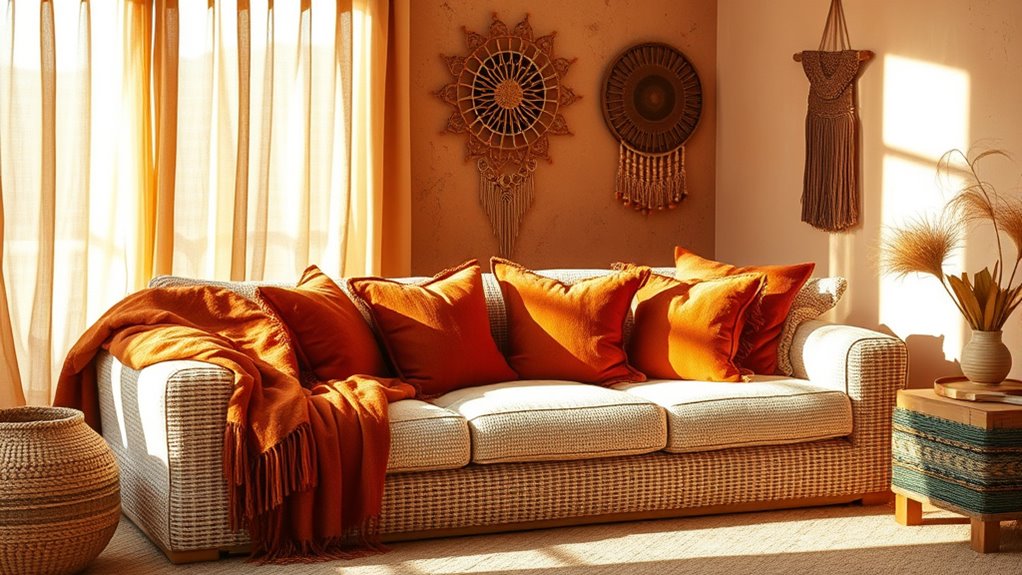
Bold Color Combinations
Bold color combinations in boho interiors instantly energize a space, creating a lively and inspiring atmosphere. By mixing bold hues like fiery reds, vibrant oranges, and sunny yellows, you craft vibrant color schemes that stimulate the senses. Incorporating contrasting tones, such as rich earth tones or soft pastels, enhances visual interest and highlights focal points like textiles or shelving. This approach encourages creativity and sparks lively conversations, embodying the eclectic design spirit. To elevate your space further, consider:
- Using contrasting tones for dynamic visual interest
- Highlighting focal points with vivid colors
- Balancing energetic hues with neutral backgrounds
- Combining saturated hues to create a lively atmosphere
These bold color combinations not only boost mood but also foster a sense of adventure, making your space truly inspiring.
Creative Accent Uses
Building on the energy created by bold color combinations, incorporating vibrant hues into your accent pieces can substantially energize and inspire your boho interiors. Use energetic hues like fiery reds, bright oranges, and sunny yellows on accent walls, furniture, or decorative accessories to create lively focal points that spark creativity and social interaction. Pair vivid color combinations with eclectic patterns and textures to enhance artistic expression and foster spontaneous, dynamic spaces. These bold accents boost mood and motivation, making your interior design more stimulating. To prevent overstimulation, balance vibrant colors with neutral or earthy tones, ensuring lively spaces remain harmonious. By strategically using vibrant hues in accent elements, you craft a vibrant environment that energizes and inspires at every turn.
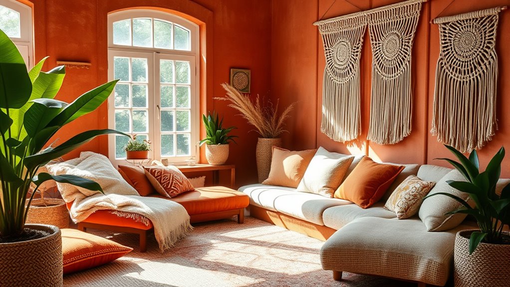
Combining Colors for a Harmonious Boho Space
To create a harmonious boho space, you’ll want to balance bold colors with neutral tones, preventing the room from feeling overwhelming. Layering textures and patterns adds depth and personal flair, making your space more inviting. Using accent colors thoughtfully can energize the room while maintaining visual cohesion and interest. Incorporating unique and wicked planters can also serve as eye-catching decor that complements your color scheme and enhances the overall mood of the space. Additionally, understanding color psychology can guide you in choosing hues that evoke the desired emotions and atmosphere in your boho interior.
Balancing Bold and Neutral
Achieving harmony in boho interiors often means thoughtfully blending vibrant colors with neutral tones. This balance creates visual harmony and prevents the space from feeling overwhelming. Using neutral shades like beige, taupe, or soft whites as a base allows bold colors—reds, oranges, or blues—to stand out without clashing. To enhance design harmony, consider layering textures and patterns alongside your color choices. Incorporating high-end materials can elevate the overall aesthetic and reinforce the luxurious feel of the space.
- Use a neutral color palette to ground bold hues
- Incorporate contrasting textures for depth
- Leverage the psychology of color to influence mood
- Achieve visual balance through strategic color placement
This approach fosters mood enhancement and stability, ensuring your space feels cozy yet lively, embodying the true essence of boho interiors.
Layering Textures and Patterns
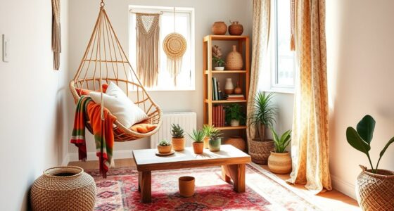
Layering textures and patterns is a powerful way to bring harmony and depth to your boho interior. By combining different textures—woven, embroidered, fringed—you create tactile richness, while layering patterns adds visual interest. Mixing boho colors such as earthy browns, vibrant jewel tones, and muted neutrals in various patterns—rugs, fabrics, wallpapers—establishes a balanced, cohesive look. Thoughtful color combinations evoke specific moods, from relaxed to energetic, enhancing the space’s emotional appeal. Layering textures and patterns also increases visual complexity, making your space feel curated and inviting. Incorporating air quality principles through the use of air purifiers can further enhance your eco-friendly interior by reducing allergens and odors. This strategic layering helps personalize your boho interior, transforming it into a cozy, expressive environment that reflects your unique style and personality. Additionally, selecting materials that support well-being can promote a healthier, more comfortable atmosphere within your space.
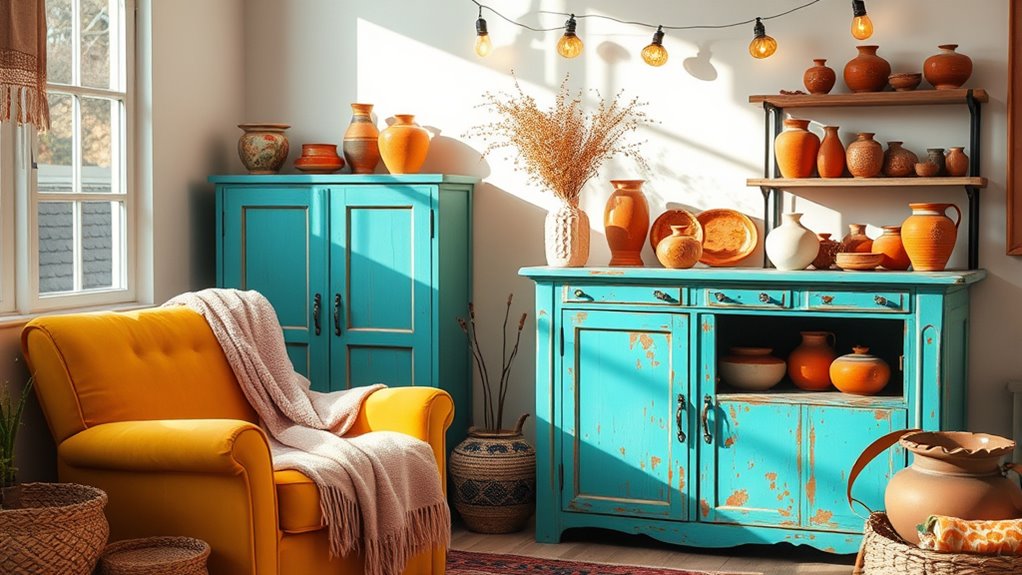
Using Accent Colors Effectively
Combining accent colors thoughtfully can transform your boho space into a lively yet cohesive environment. Use accent colors to add visual interest and highlight key areas or decor accessories. Layering multiple hues—such as jewel tones with soft pastels—creates depth and personality without clutter. Contrasting hues, like deep blues against warm yellows, enhance the eclectic vibe. To maintain harmony, select a dominant color scheme and use accent colors sparingly. Consider these strategies:
- Pair complementary hues for vibrant contrast
- Incorporate accent colors through textiles and artwork
- Use layering to add depth and personality
- Highlight specific areas with bold accent hues
Practical Tips for Implementing Color Psychology
To effectively implement color psychology in your boho interiors, start by selecting a balanced palette that reflects your desired mood and personality. Use natural tones like beiges, browns, and greens to create a calming, nature-inspired environment that promotes relaxation. Incorporate vibrant accent colors such as Moroccan yellows, Southwestern blues, and jewel tones to evoke energy and cultural richness. Layer pastel shades like mint green, peach, and lilac for a soft, whimsical vibe that enhances a light, airy aesthetic. Practical tips include balancing bold colors with neutral accents to prevent overload and experimenting with color combinations through textiles, artwork, and accessories. This approach helps you control emotional responses and achieve a cohesive, personalized space that effectively creates mood through thoughtful layering and contrasting hues.
Personal Expression Through Color Choices
Personal expression in boho interiors is all about choosing colors that showcase your unique tastes and cultural influences. You can achieve this through eclectic color combinations that reflect your personality and heritage. Vibrant hues like Moroccan yellow and Southwestern blue highlight your creative expression and free-spirited style. Layering colors—mixing earth tones, pastels, and bold shades—creates a dynamic, personalized ambiance. This approach allows you to curate a space that tells your story and embodies your individual tastes. By intentionally selecting colors and cultural artifacts, you elevate your boho interiors into a true reflection of your identity and artistic freedom.
- Use eclectic color combinations to showcase your personality
- Incorporate vibrant hues inspired by cultural influences
- Layer colors for depth and visual interest
- Mix and match to tell your personal story
Frequently Asked Questions
What Are the Psychological Effects of Color in Interior Design?
You might wonder about the psychological effects of color in interior design. Colors influence your mood and behavior—blue can calm you, while red energizes you. Warm hues like yellow make you feel happy, and cool shades like green promote trust. By choosing the right colors, you can create spaces that boost your well-being, productivity, and comfort, making your environment truly reflect the mood you want to evoke.
What Is the 3 Color Rule in Interior Design?
Think of the 3 Color Rule as a harmonious symphony for your space. You choose one dominant hue to set the mood, a secondary color to support, and an accent to add a spark. This trio keeps your room from feeling chaotic, like a well-composed melody. Sticking to this balance, often in a 60-30-10 ratio, creates visual rhythm and unity, making your interior both engaging and calming.
What Is the 60/30/10 Color Rule?
The 60/30/10 color rule helps you create balanced, harmonious interiors. You use 60% of your space for the dominant color, like walls or large furniture, setting the overall tone. Then, 30% goes to the secondary color for major accents such as upholstery or rugs. Finally, 10% is for accent colors in accessories like pillows or artwork, adding visual interest and making your space feel cohesive and well-designed.
What Is the 70/30 Rule in Interior Design?
Perfect proportion promotes peaceful, pleasing spaces. The 70/30 rule guides you to allocate 70% of your room to dominant colors or styles, like walls or large furniture, while reserving 30% for accents and accessories. This balance helps you create a cohesive, engaging environment, avoiding overwhelm. When you follow this simple, strategic rule, your space feels harmonious, inviting, and just right, making your interior design both easy and enjoyable.
Conclusion
Like a painter blending hues on a canvas, your color choices shape the story of your boho space. By understanding how warm earth tones comfort, cool shades soothe, and vibrant hues energize, you craft a mood that’s uniquely yours. Embrace your personal palette, and let your room become a sanctuary of expression—where every color whispers your vibe. With intentionality and creativity, your space will sing the vibrant song of your soul’s true colors.